The best virtual staging styles for empty rooms are the ones the realistic buyer for that property would recognize as their own taste, slightly upgraded — not the most dramatic style, and not the one you personally like. Six styles cover most residential listings: Scandinavian, modern, transitional, minimal, coastal, and mid-century modern. This guide explains when each one wins, how to choose by property and buyer, how to adjust room by room, and the mistakes that make good staging fail anyway.
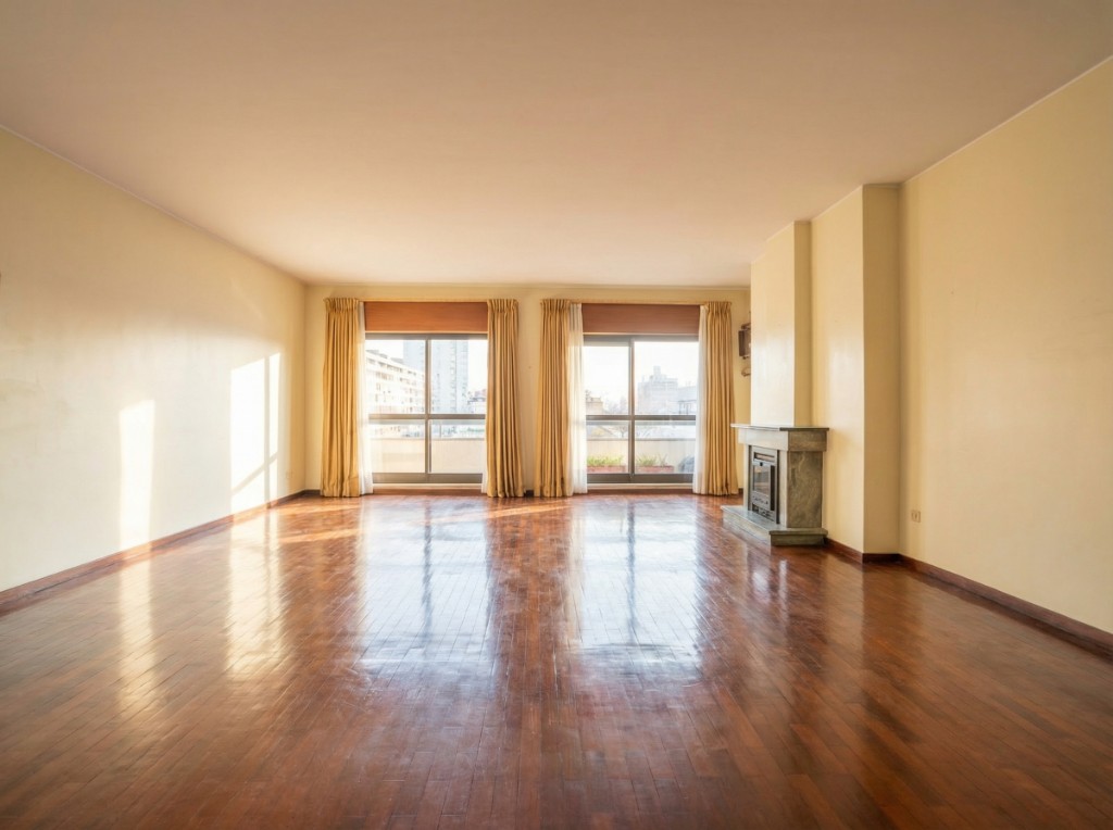
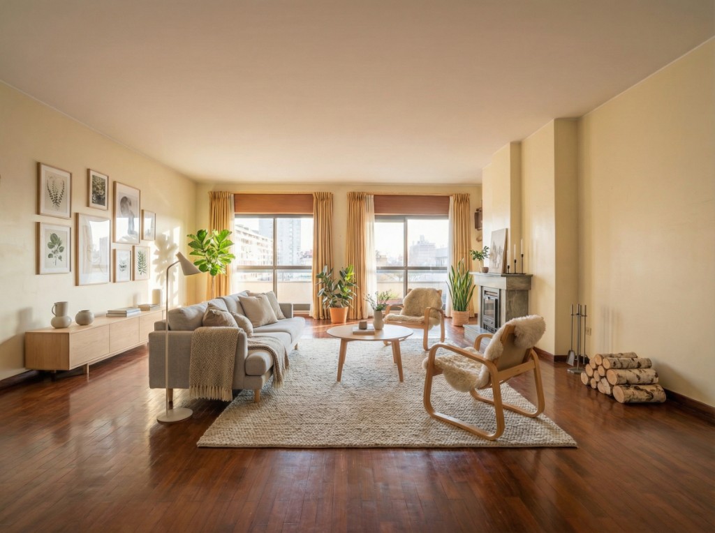
Why style is a positioning decision, not a design decision
An empty room gives the buyer nothing to react to. It reads as smaller than it is, the proportions are hard to judge, and the listing photo competes with thirty others on the same portal page. Staging solves that, but the style you choose is doing a second job: it tells the buyer who this home is for.
A first-time buyer scrolling on a phone reacts to a light, uncluttered room that looks affordable to furnish. A downsizing couple reacts to comfort and quality. A design-aware urban buyer reacts to confidence and restraint. Get the style right and the buyer self-identifies within a second. Get it wrong and the photo is technically good but emotionally off.
So the question is never 'which style looks best' but 'which style fits this property, this street, and this price point'. If you are new to the concept, the virtual home staging guide covers the fundamentals first.
The best virtual staging styles for empty rooms: six that cover most listings
You do not need a library of twenty styles. These six cover the large majority of residential listings, and each has a clear situation where it wins.
Scandinavian
Pale wood, white and off-white walls, linen and wool textures, low furniture, a plant or two. It photographs well in almost any light because the palette reflects rather than absorbs, and it is the closest thing to a universal default for portal photos. Use it for apartments, starter homes, and any room with modest natural light. Its weakness is that it can feel generic in a high-end listing and too casual in a formal period property.
Modern
Stronger contrast, darker accents, sharper silhouettes, metal and leather alongside wood. It suits new builds, city condos, lofts, and anything with large windows and clean architecture. It rewards good light and punishes bad light: a dark modern sofa in a north-facing room can swallow the space. For a detailed head-to-head, see Scandinavian vs modern staging for listings.
Transitional
The bridge between traditional and contemporary: tailored upholstery, neutral palette, a few classic shapes without heavy ornament. This is the safest choice for suburban family homes, houses with moldings or fireplaces, and any buyer pool that skews older or more conservative. It rarely wins on drama and rarely loses on fit.
Minimal
Very low furniture count, negative space on purpose, one or two strong pieces. Use it when the room is small and needs to feel bigger, or when the architecture is the selling point and furniture should stay out of the way. Overuse makes a listing feel cold and unfurnished, so keep it to rooms where space is the message.
Coastal
Whites and sand tones, blue accents, rattan and light wood, relaxed shapes. Obvious for waterfront and holiday properties, but it also works in bright top-floor apartments and sunrooms anywhere. Avoid it in urban listings far from water, where it reads as a costume rather than a lifestyle.
Mid-century modern
Warm walnut tones, tapered legs, low profiles, a little pattern and color. It suits character homes, 1950s–70s architecture, and buyers who follow design. It is the most specific of the six, so use it when the property earns it rather than as a default.
How to choose: property first, buyer second, room third
Work through three questions in order. Most of the time the first two decide it and the third fine-tunes.
1. What does the architecture already say?
Look at ceiling height, window style, floor material, moldings, and built-ins. Herringbone parquet and tall sash windows want transitional or Scandinavian. Concrete floors and floor-to-ceiling glass want modern or minimal. Exposed brick and original timber want mid-century or a warm transitional. Fighting the architecture is the most common style error and the easiest to avoid.
2. Who is the realistic buyer?
Not the dream buyer, the realistic one for this price and this street. Two-bedroom flat near a university: young professionals or first-time buyers, so Scandinavian or minimal. Four-bedroom detached in a school catchment: families, so transitional with warmth. Penthouse in a new development: design-aware buyers, so modern. When the property could go either way, pick the style with the broader appeal.
3. What does this specific room need?
The style stays constant across a listing, but the furniture count changes by room. Small bedrooms need a bed, two nightstands, and nothing else. Living rooms need a sofa, a rug, a coffee table, and one anchor piece such as a sideboard. Dining rooms need a table sized to the room, not to the catalog. Room guides: how to stage a bedroom for real estate and how to stage a living room to sell.
Light, orientation, and why some styles fail in some rooms
A style that works in the brochure can fail in the room because of light. North-facing rooms and rooms with a single small window have cool, flat light. Dark furniture in that light goes muddy, and modern staging with black metal and charcoal upholstery loses its edge. Scandinavian and coastal palettes bounce the little light there is and make the room read larger.
South- and west-facing rooms with warm afternoon light do the opposite. Very pale Scandinavian staging can blow out and look washed, while modern and mid-century pieces with some depth hold their shape. If a room is genuinely dark, fix the photo first — see how to make dark room real estate photos look bright — and then choose the style.
A useful check: after staging, look at the shadows under the furniture. They should fall the same way the window light falls in the original. If they do not, the piece will look pasted on regardless of how well the style matches.
Applying a style in one click with PhotoStaging
In PhotoStaging you upload the empty photo, select the room type, and choose a style — or upload a reference image if you want a specific look matched. The staged image is ready in about 20–30 seconds as a full-resolution JPEG. Each image costs one credit; on the yearly plans that works out to roughly €0.19–€0.24 per image.
That price changes how you use style. Instead of guessing, stage the main living room in two candidate styles for two credits, put them side by side, and pick the one that fits the buyer. Then apply the winner across the rest of the listing. For a brokerage look rather than a generic style, the style by reference guide explains how a reference image drives the result.
Choosing a staging style in PhotoStaging
Pick a room type and a preset style; the staged image is ready in about 20–30 seconds.
Mistakes that undo a good style choice
Most weak staging is not the wrong style. It is the right style applied carelessly. Watch for these.
- Switching styles between rooms of the same property. The listing stops reading as one home. Pick a style and hold it from the entrance to the last bedroom.
- Over-furnishing small rooms. If the buyer cannot see a clear walking path through the photo, the room looks smaller than it did empty.
- Ultra-modern staging in a traditional neighborhood, or heavy traditional pieces in a new build. The buyer notices the mismatch even if they cannot name it.
- Ignoring scale. A sectional that would not fit through the door destroys trust the moment the buyer visits.
- Staging every room. Utility rooms, small hallways, and bathrooms usually look better clean and empty. Stage the rooms that sell the home: living, main bedroom, dining, and any room whose purpose is unclear when empty.
- Forgetting the disclosure label. Whatever the style, mark the image as virtually staged — see can you use virtual staging images in portals and ads.
Next steps
Once you have a default style for each type of property you list, staging becomes a two-minute step in the photo workflow rather than a decision every time. For keeping furniture consistent across a whole listing, see how to match furniture style in virtual staging.
Start with PhotoStaging — your first images are free.
Frequently asked questions
Should I use the same style across all my listings?
Within a single listing, always; across your portfolio, adapt to each property and its buyer. A brokerage brand can still show through in consistent photo treatment and a small set of preferred styles, but forcing one style onto every property costs you fit.
Is Scandinavian always a safe choice?
It is the safest generic default for apartments and average-light rooms, which is why so many portal photos use it. It is not the best choice for large formal homes, luxury listings, or strongly traditional architecture, where transitional or a warmer style fits better.
Can I combine two styles in one room?
Yes, if they share a palette and level of formality. Scandinavian with a few mid-century pieces, or modern with coastal textiles, reads as intentional; industrial metal next to traditional upholstery does not. When in doubt, pick one and stay with it.
How many rooms should I stage?
The rooms that decide the sale: living room, main bedroom, dining or kitchen-dining, and any room whose function is ambiguous when empty. Bathrooms, hallways, and utility spaces usually do not need furniture and can look cluttered with it.
Does the style need to match the furniture the seller will leave?
No. Virtual staging shows the potential of the space, not an inventory. The property should be disclosed as vacant or as virtually staged so the buyer is not expecting the furniture to be included.
Ready to start?
Create listing-ready visuals in minutes. No credit card required.
Read the full guide: Virtual Home Staging for Real Estate Listings